Are carousels a good tactic?
During the redesign or creation of a website, it may be tempting to use a carousel on the homepage and section pages for several reasons, such as:
- Passing multiple messages simultaneously,
- Showcasing content of equal importance,
- Avoiding overloading the page with unnecessary information,
- Providing equal space and visibility to all organization departments.
However, it is better to resist the temptation of incorporating a carousel at the top of the homepage or section headers. I personally advise against using a carousel, especially an auto-scrolling one, as they are inefficient in achieving the desired goals.
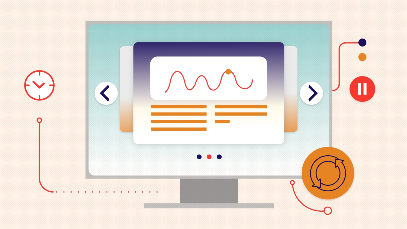
Carousels on a web page: why should they be avoided?
There are only 2 occasions where I recommend integrating a carousel on a web page:
- To display images of the same type, such as a photo gallery.
- To showcase multiple products for sale, as Facebook and Instagram do with their Carousel ads.
If you want to integrate a carousel for any other reason, I'll explain why you should give up on doing so, regardless of the type of carousel.
Auto-scrolling carousels
The use of an automatic scrolling carousel is, in my opinion, the worst tactic for a web page. First, because people do not read at the same speed. Some people will not have time to read the entire content before the next one appears, which can be frustrating.
Secondly, this type of carousel could impair the understanding of other content on the page because the motion created by the automatic scrolling of images can be a distraction for users.
Carousels with pause buttons
If automatic scrolling of a carousel isn't a good idea, why not add a button that allows users to pause it?
Let's say it's less bad, as this tactic gives people some control over the interface. It's even possible to add left and right arrows so the user can scroll through the carousel images at their own pace. However, it's still not the best solution.
What we need to understand is that only the first image of a carousel gets the majority of the visibility, and therefore potential for conversion. According to Erik Runyon, Technical Director of Marketing Communications at the University of Notre Dame, only 1% of visitors will scroll through carousel images on a high-traffic website. When target audiences are more niche, average carousel scrolling usage increases slightly to reach between 1.7 and 2.3% interaction.
In short, using a carousel does not achieve the goal of highlighting multiple elements at the same time and at the same level. The key to achieving this is to prioritize a single key message per page and eliminate anything that is superfluous.
Capturing attention on the web: a matter of seconds
In television advertising, agencies generally have a 30-second time slot to deliver their message. On radio, it's between 10 to 15 seconds. But on the web, you need to be even quicker than that!
In fact, visitors to your website won't wait several seconds to see and understand what you have to offer. You have about three seconds to do so. Therefore, you need to make choices by clearly identifying the message that should predominate and finding a way to quickly capture the visitor's attention. Once interested, the visitor will continue to navigate your site. It's only from this point that you can give them details, build a story, and deliver more messages to promote user interaction and conversion.
Improving conversion requires good information hierarchy
Carousels that display multiple different messages are ineffective because they are often perceived as advertising banners. They create a phenomenon of advertising blindness, which means that users intentionally or unintentionally ignore content that looks like advertisements. For this reason, it is recommended to broadcast only one message at a time to improve the level of engagement and conversion of your content.
Therefore, it is important to think about ways to prioritize information, clarify the message, and simplify the design. To help you, you can follow the old technique of the inverted pyramid, which means starting with the general message (the most important), then branching out to more specific elements when the user chooses to delve deeper.
Attracting attention, outlining the main points first, and then presenting all the necessary details is a much more profitable approach to improving the user experience than grouping several disparate messages into a carousel.
Digital strategies that promote engagement.
In summary, if I had one piece of advice to give you to achieve your online goals, it would be this: forget about carousels and opt for simplicity. Reduce as much as possible the possible elements of distraction to focus all of your content on what really matters.
And if you don't know where to start, we have solutions tailored to your reality to help you!